
Areas I would like to Improve


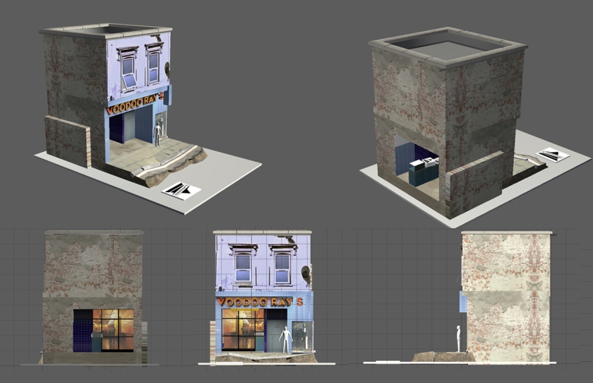
In early tests I tried to create a modular brick wall for the side of my building which didnt match with the rest of the scene and proved a dead end. I took on a different approach to previous methods and instead of sculpting on a general brick stamp to a flat surface I chose to build up the wall from a series of bricks and sculpt in-between. Including the retopologising (which reproduced harsh shadows at the seams between brick sections) it was about 2-3 days of work that wasn’t included in the end result. In the future I will likely do my sculpt onto a flat plane and then make any deformations or modularity in Maya.


Due to time restraints I am unhappy with the rubble section that connects my scene to the small stand it is placed on. It is far too low poly and doesnt have any interesting geometry detail. This is something I will need to improve before I include it in any future portfolio work. Similarly my wall edges are too well rounded and have an unrealistic bend to them.
I would also have liked to spend more time baking to get mo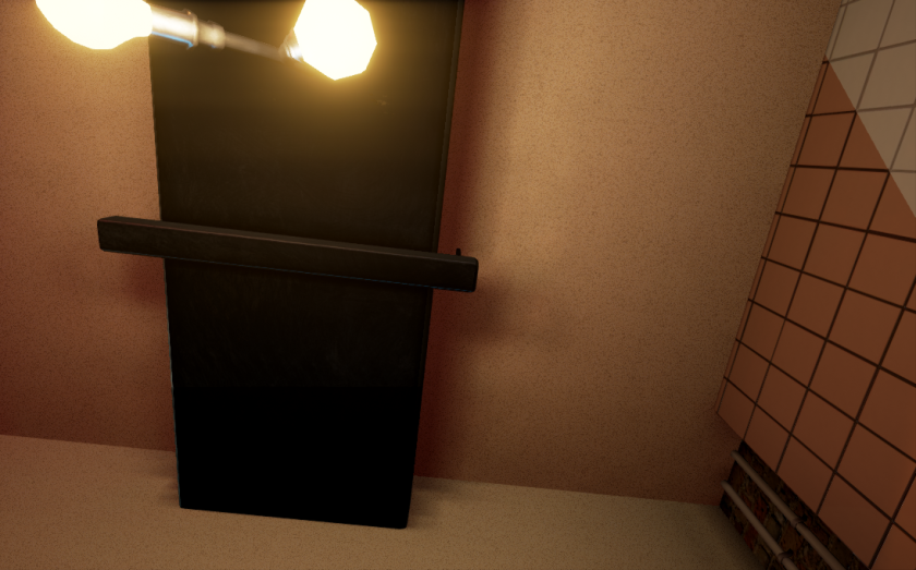 re precise shadows but the only possible solution was to reduce the overall world scale to get more sample and that just quadruples your baking time. I messed around with smoothness but that also put a heavy burden on the rendering time.
Lighting


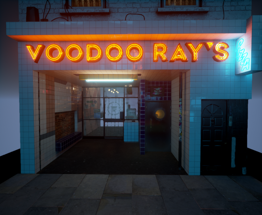
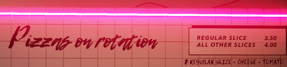
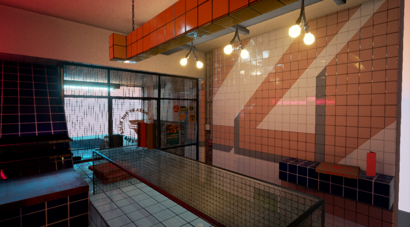
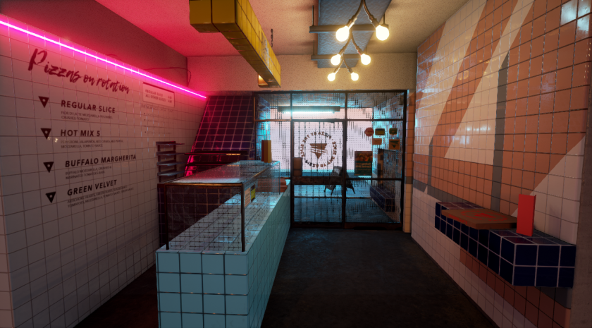
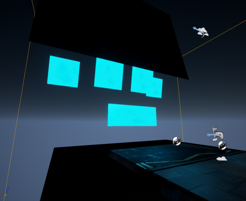
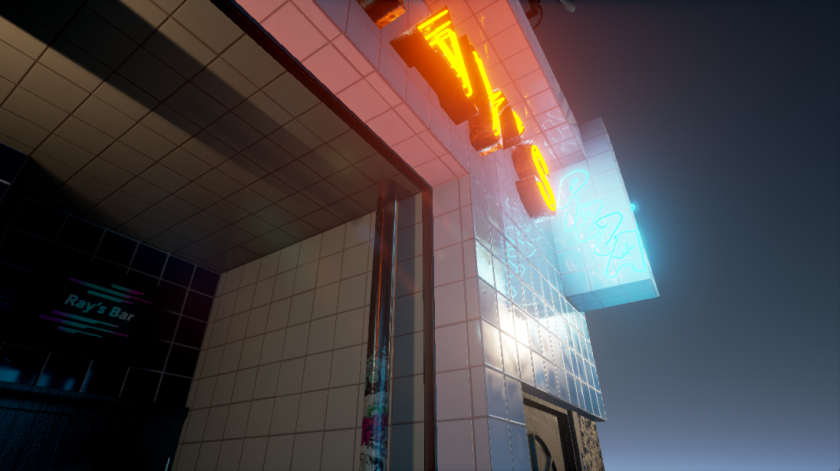
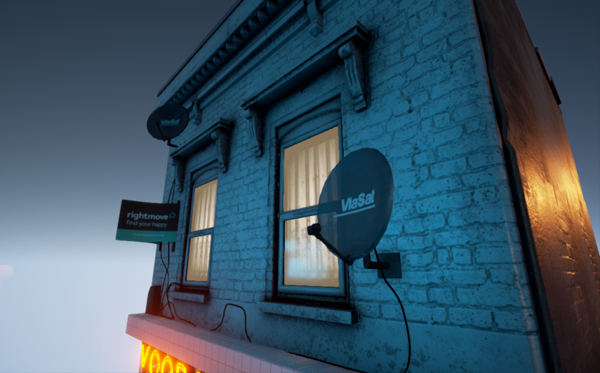
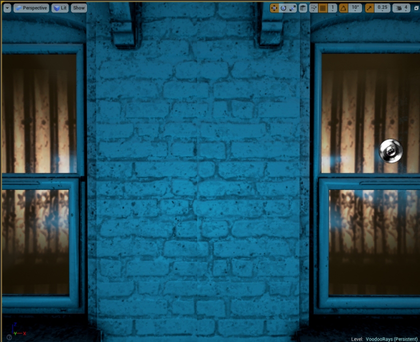
Lighting development started from the Neon emissive lights and then worked outwards. The neon/halogen lighting in the scene is a distinct part of the style and ensuring they were lighting the surrounding area correctly first was important to my own way of breaking things down. In order to best show them off this also meant I would need to be creating a night time scene. After the main lights were established I then used a series of emissive cards to fill the street with blue light to contrast the orange/red in the Voodoo Ray’s sign and lit the back of the building with a low angled orange light to simulate sunset.
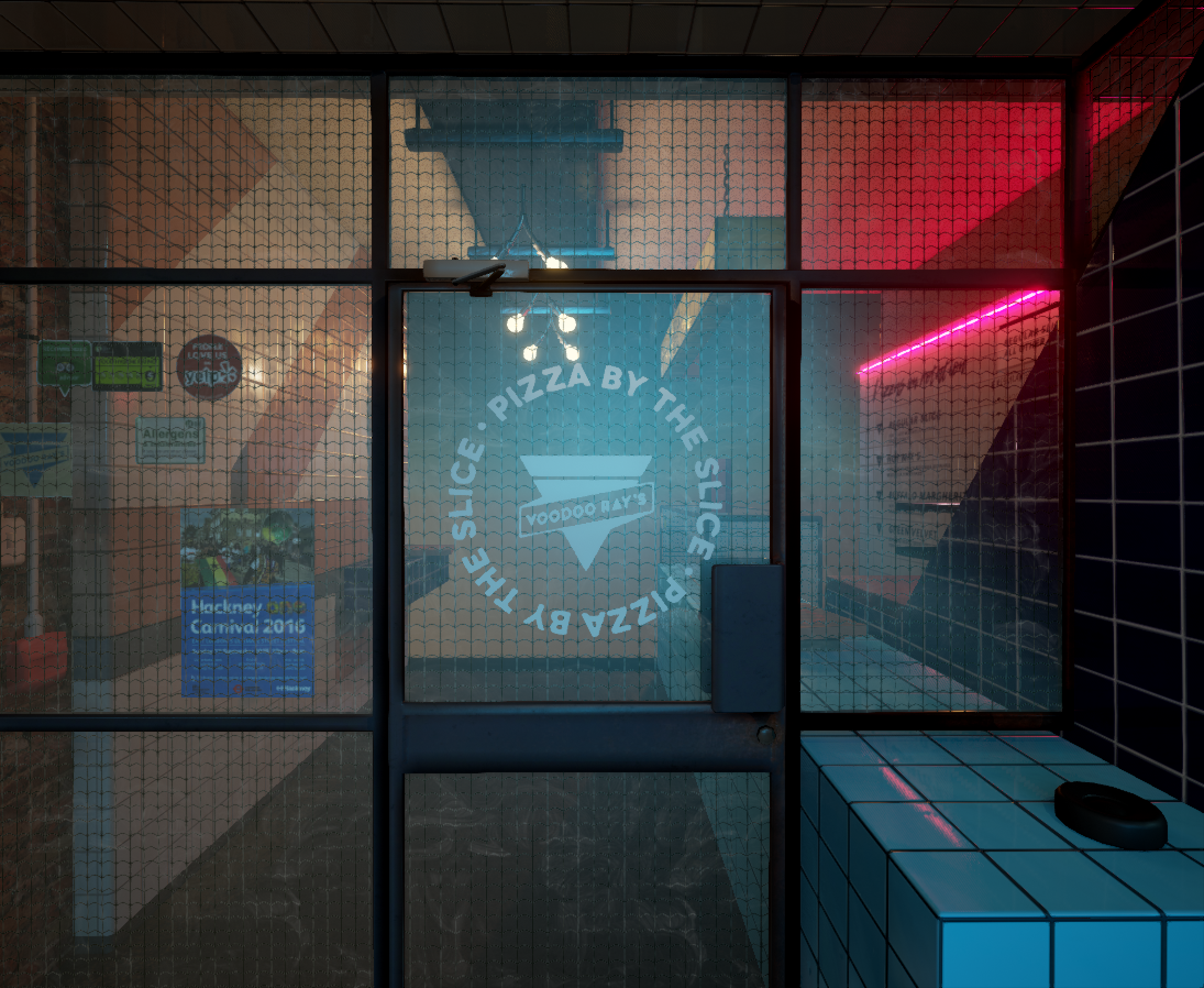
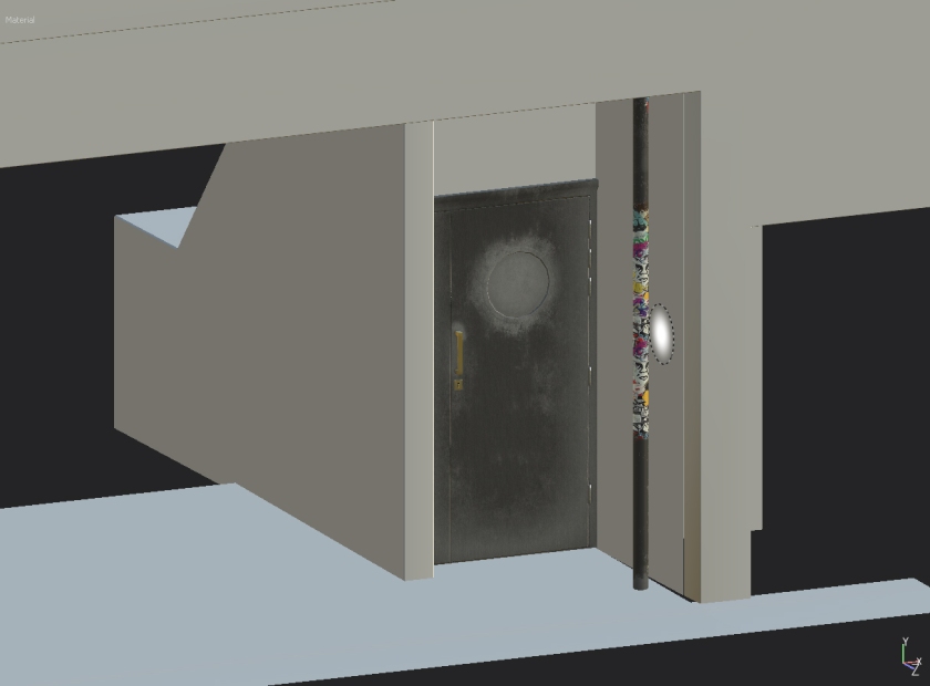
For some unknown reason I was getting change in lighting along the edges of my entrance. My suspicion is that the emissive light from the Neon sign was passing through the object and giving it a red glow. As there was no consistency to this error I was forced to put a frame dividing the sections to cover the contrast. This is still in keeping with the reference however as there is an additional section where the metal shutters come down that I had removed during the development for the sake of time.
Materials and Textures


I’m very pleased with my progress in working with materials and textures for this project.
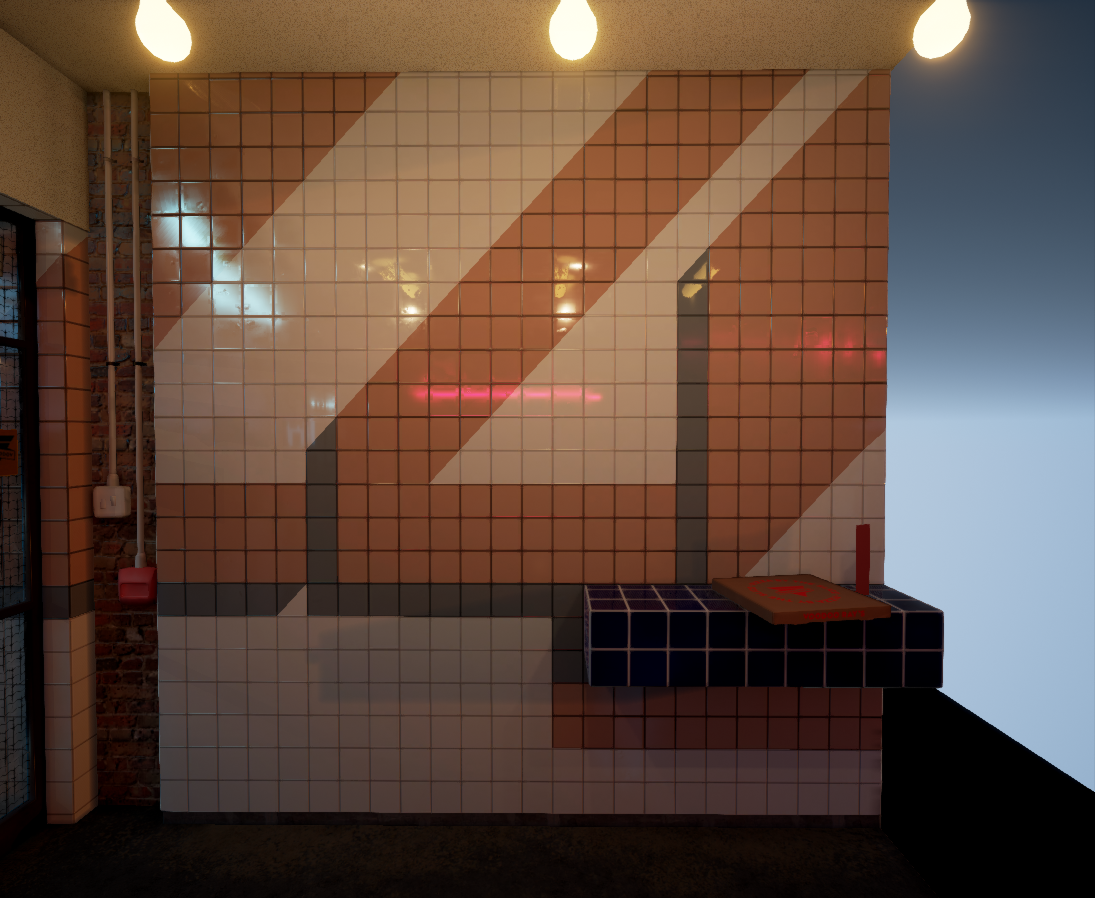
The material that defined much of the style of was the different coloured tiles decorating the scene. The two main aids to my creation of this material was some advice from a past student George O Keefe and some online tutorials by Philip Klevestav. George advised me to create a primary tiled material and then place the coloured instances by assigning various material IDs to pre-cut areas of geometry.
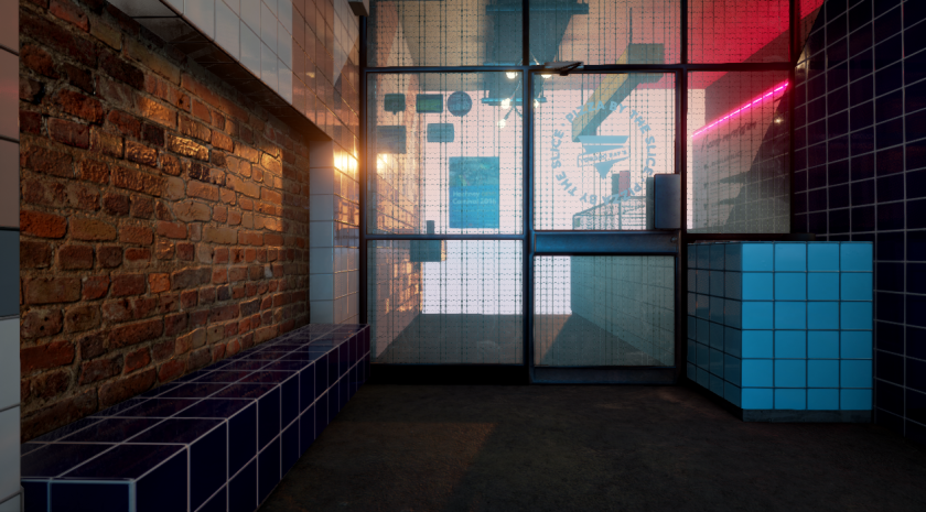
Philip Klevestav’s online tutorial helped to create more dynamic reflections by advising the use of light amounts of overlayed colours on the tiles’ normals. This meant that each tile had a slightly different angle in the tangent space and reflections were broken up along the surface. This method was also use for the brick material seen at the side of the building.


The area I am most pleased for contrast of materials is the Ray’s Bar section as I believe I executed each material quite well and they contrast from each other. There is a parallax based reflection, a graffitied pipe with stickers, a concrete floor and clean tiles. A nice mix of matte/reflective and complex/simple.
In developing my materials some quick points I will be adopting for my workflow in the future is to have any assets that are close to each other in the end scene loaded simultaneously while working in Substance Painter. The MG Dirt and other AO based generators also take into account the presence of nearby objects during the bake and so materials/masks get an extra boost.
 Also labeling the materials after the names of their assigned objects is a massive time saver. Saves a lot of time renaming files after export.

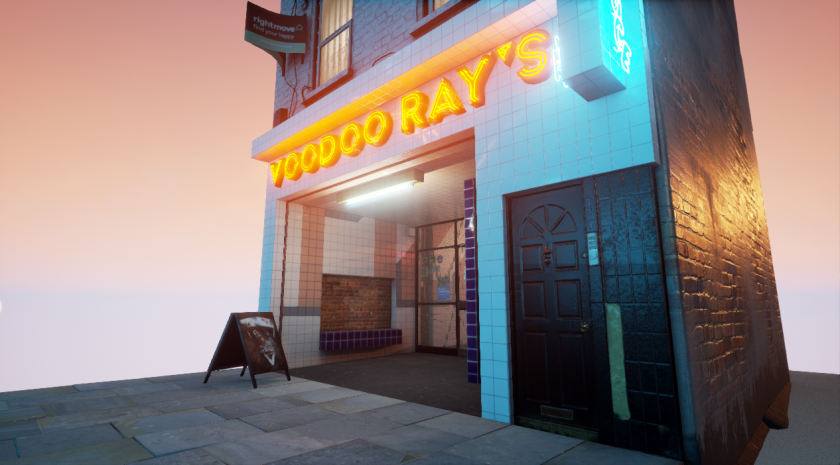
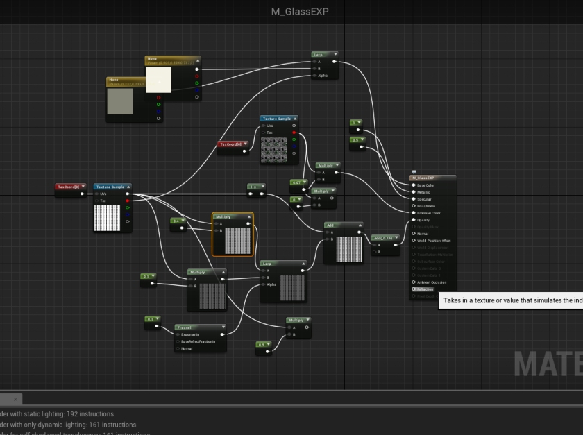
My most complex material in the scene would likely be the glass for the main door. I took the glass material produced by Koola for his example Lightroom scene and then added some additional maps to suit the reference. I also took inspiration from the glass in the King Wash Laundromat which I think added a light amount of emissive combined with a roughness map to maintain a slight rough stain that the light might not be able to catch.


Towards the end of my project I finally managed to get a handle on Substance Painter and it made a massive difference in my overall development. With a handle on the height maps I was able to work far quicker on my concrete floor and various other elements. Previously I had created normals for flat objects such as the road using Zbrush; A finicky and awkward way of working and not too mention havoc on my graphics card. I used a series of stamps produced in Photoshop and to carve out a molded cement like material with cracks and stains very similar to the reference.


To avoid having to create an entire interior scene for the upstairs windows I made use of parallax maps to simulate a sense of depth behind the window using the following tutorial. This also proved useful for the window into Ray’s Bar giving an extra sense of depth and detail.


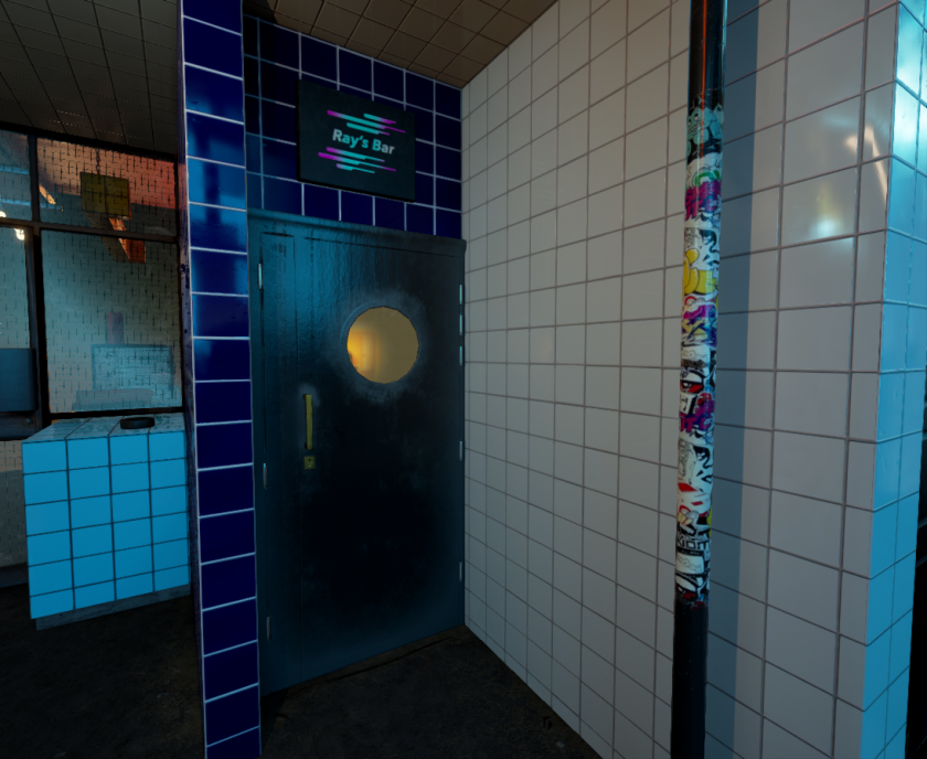
For the text lining the interior walls I made use of Decals. The text was created in Photoshop after sourcing a similar font to the Voodoo Ray’s brand. The stickers on the door frame however are simply masked planes.
For the satellites I used a simple opacity fade rather than a trying to mimic the minute mesh pattern as anti-aliasing would take over at a distance and the effect would be lost. This effect can be seen in the main doors of the restaraunt as I have embedded a wire pattern in the glass material which distorts and fades out as you move away.
As there was sometimes a slight difference in appearance between materials in Substance and in Unreal a very useful function that I often used was the power sign which offers to contrast and lighten/darken the image. Combined with the roughness this proved incredibly useful for making minor adjustments quickly.
Modelling
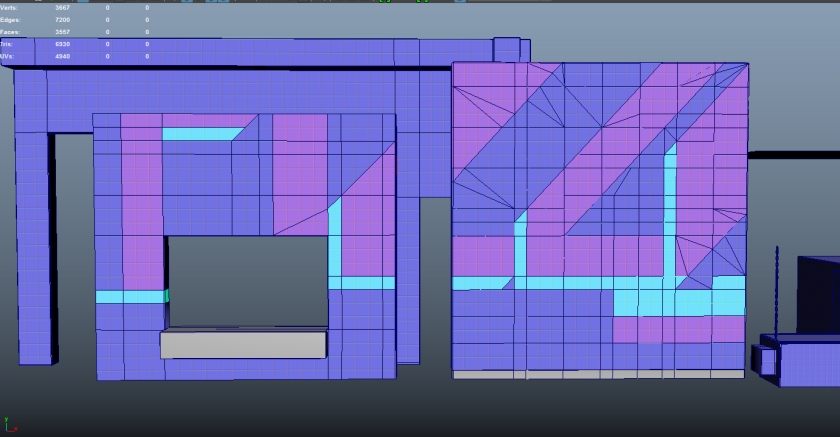
For this project modelling was a major step up as we took on not only new softwares but a far more complex pipeline for production. With the the introduction of Zbrush and Substance Painter it became important to compartmentalise our construction into stages of blockout, geometrical detail and material detail so that we could use the appropriate tool. The line between between these areas is very blurry and does depend to a degree on personal preference. The most valuable learning I have done on this project would be in developing a comfort and affinity with where these lines fall for myself. Initially I leaned heavily on Zbrush because I missed out on some classes on Substance Painter and had a few clunky experiences using its height layers.


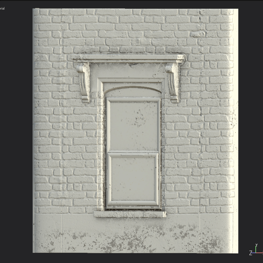
My first areas of development in “Next-Gen” modelling were in Zbrush creating the brickwork of the neighbour’s door and the windows above the restaurant front. It required a lot of back and forth between Zbrush and Maya initially. Getting the right topology to divide well in Zbrush and keep its creases was tricky as there was issues with the Maya ascii export when trying to load multiple meshes with creases. This caused a lot of back and forth trying to resolve the technical error. Once resolved though it was a relatively smooth process of using the inflate tool with a simple brick mask and then adding in detail with other brush such as the clay tubes tool and flatten tool.


Although I found my development with Zbrush relatively smooth there was a drawback when it came to creating seamless textures along the edges between objects. To keep polycounts reasonable within ZBrush I imported the window facade with both corners combined into one section. This meant I could create one material for the left and right sections of the facade and sculpt a brick pattern across the front of the building. The issue however was that there would be a slight break when I line up 2 window sections beside each other. I tried my best to reduce this but just couldn’t get the pixel perfect accuracy I needed. In the end with time considerations and the addition of materials to the object I felt other areas needed my focus.
The neighbour door was a good example of learning to make proper use of the Subtool function within Z-Brush as it contained many different components that needed to be updated/re-imported individually throughout the process. It ended up being roughly 9 different pieces with distinct surfaces e.g. the doorbell and the cracked concrete.


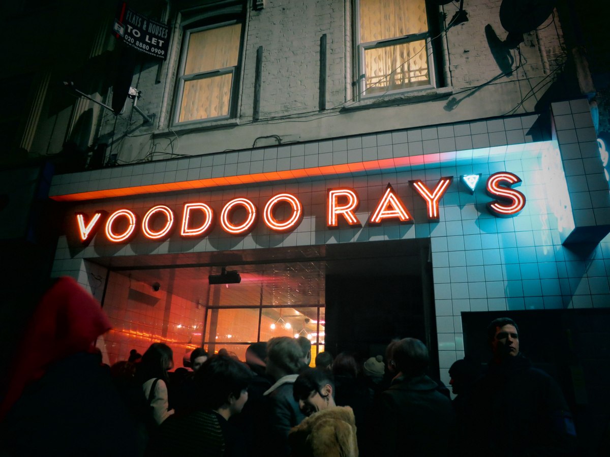
Art Direction
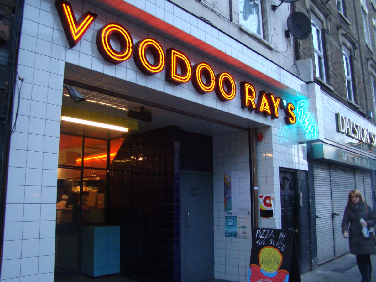


During the idea stages I presented my tutor Simon with 3 ideas for the project. A surfboard shack, a fantasy temple and the Voodoo Ray’s restaraunt/takeaway. My overall focus with the ideas this time around was to choose environments with a good opportunity for materials/texturing and to stay away from the mistake of the previous project and choosing a scene with more manageable detail. I was glad to have Simon’s support for the Voodoo Rays idea as it was my favourite of the three. Voodoo Ray’s offered a mixture of old to new materials, interesting colour choices due to the neon lights and had an architectural element which I wanted to have in my portfolio for future applications to jobs in the Arch-Viz industry. An additional advantage to choosing Voodoo Ray’s was the wealth of resource material as I could go on site and take tonnes of photos. It made the project so much easier than doggedly googling badly lit, low-res photos of japanese grocery store products (…..my last project) I made a point of going out 3 times to take as many photos as possible. The staff were very nice about letting me take photos once I bought some pizza. Without these photos I wouldnt have been able to get as good an end result. I can certainly say I would not have created as interesting a diffuse material for the sidewalk. After the initial discussions I set about making a blockout to get an idea what I wanted the final version to be like.